Hello!
Even though summer-like temps are supposed to make a comeback this weekend, this week has felt very much like fall has arrived. So, in keeping with that fall vibe, I thought I’d share some of my favorite colors from Pottery Barn’s Fall/Winter seasonal palette from Sherwin Williams for 2015. They’re so cozy, it makes me want to go out and buy a plaid wool blanket, woven with all of their beautiful colors!
What I love about this palette is that the colors mix and match so beautifully. Whether you incorporate them in the form of paint, finishes or fabrics, you can’t go wrong. It’s like Garanimals for colors – yes, you could even apply these colors to your wardrobe. So keep that in mind when you’re reading this post – the colors don’t have to be limited to just paint. Let me show you what I mean.

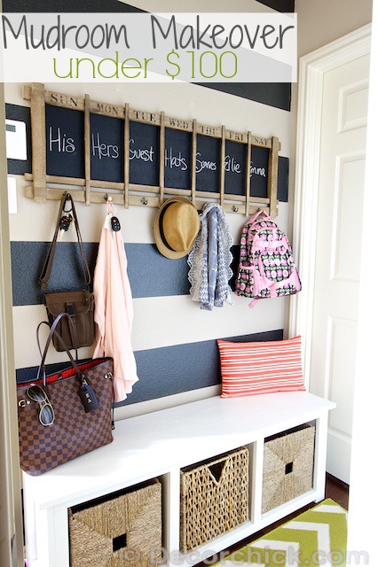
Take a look at how some of these colors are incorporated in Decor Chick’s mudroom.
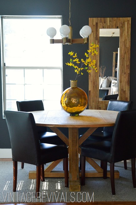
You can see here where the Iron Ore paint color is a beautiful contrast against the bright colors in the blooms in the vase here at Vintage Revivals:

And here you can see all sorts of beautiful pops of color against the Iron Ore paint color as a backdrop.
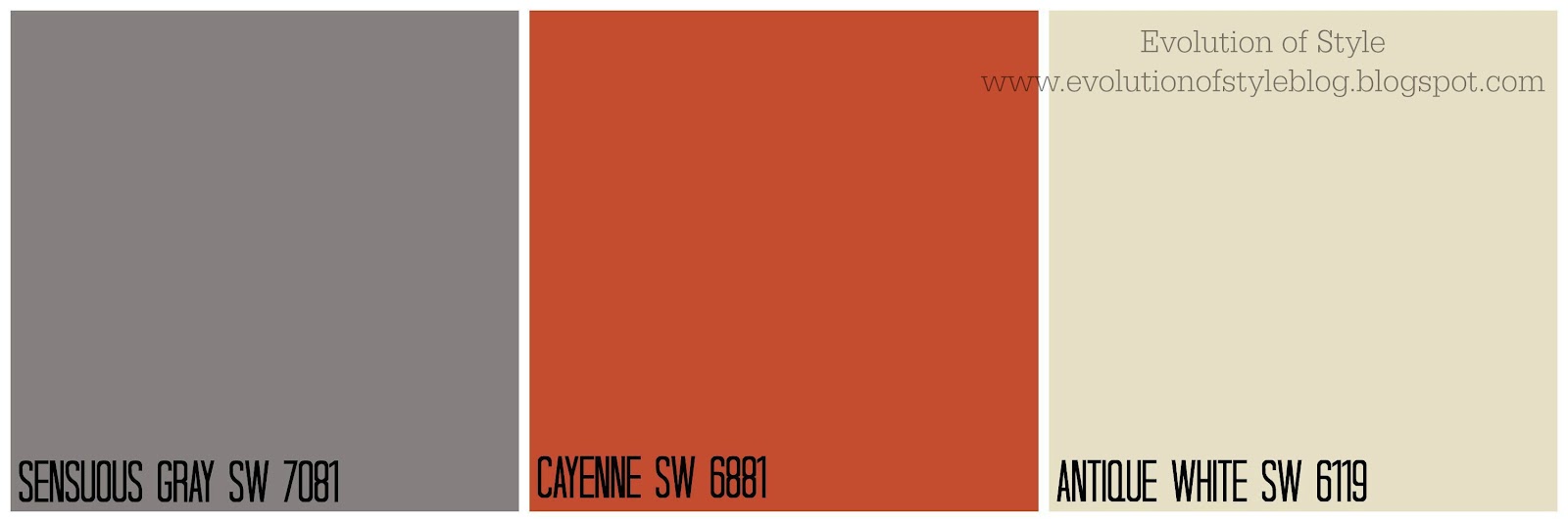
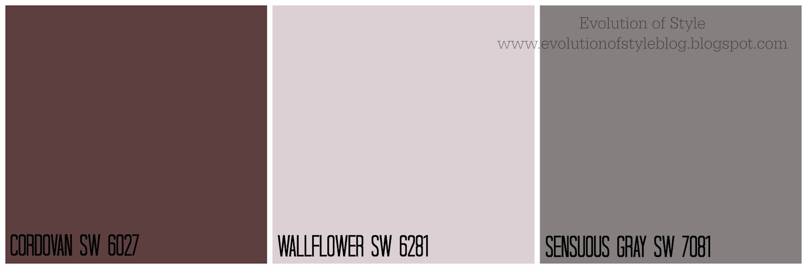
The deep plum color of Cordovan, coupled with a rich orange can play out beautifully in your home as well.

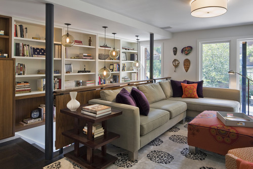
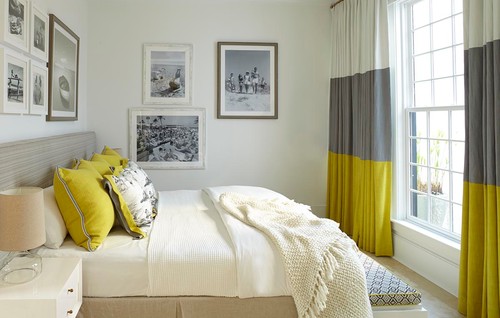
This room really caught my eye. So many beautiful elements tied together here!
The rich navy, mustard yellow of Alchemy and a hint of gray are another color combination that evoke a rich look.

These colors aren’t exact (the walls are Naval, but the dresser is a different shade than in the palette above), but you can see how these shades work together in this adorable nursery.

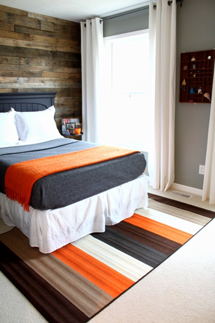
How about a cozy bedroom? Yes, please.

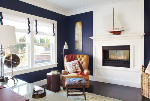
An office perhaps? Remember, these fall colors don’t have to be restricted to paint! That leather chair is perfection against the deep navy walls and crisp white trim.
Gray and orange is probably my all time favorite fall color combination. So classic and beautiful.
This warm and cozy teen bedroom at Just A Girl is one of my favorites. I just love this combination of colors together.
I love this gray, orange and cream look in this pretty laundry room.
How about some gray and orange in an office?

You know I’m a fan of this look – I incorporated these colors in my husband’s office, that I shared here, here and here.


How about some deep plum and gray? I would go light on the plum and lavender color, but they’re beautiful accents to a lovely gray.
This room is a bit more subtle in its use of plum and gray together. Gorgeous.

Definitely a soothing, more contemporary vibe.

Do you have a favorite? Be sure to check out all of the colors in Pottery Barn’s Fall and Winter Seasonal Palette.


No Comments