
Happy Friday!
I hope you’ve had a great week and are gearing up for a wonderful Mother’s Day weekend. Ours will include a “Mother’s Day Baseball Tournament”. Let me just throw this out there to coaches – as much as I love watching my boys play baseball, please don’t schedule a tournament over Mother’s Day weekend as though it’s a “gift”. We have enough games and practices every week that a tournament in our honor isn’t necessary. Just sayin’.
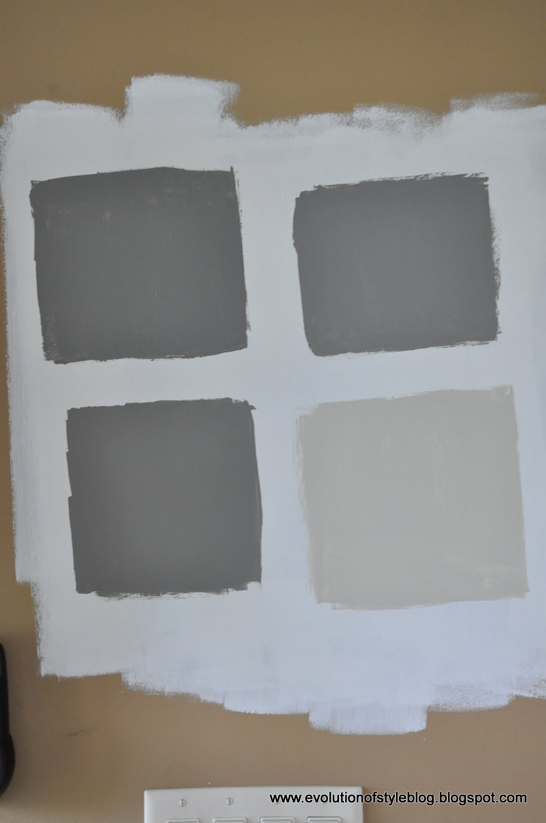
If you follow me on Facebook, you saw that I put some samples of gray paint on the walls of my husband’s office, not realizing how, um, similar they all were to one another. And this was after agonizing over a bajillion shades of gray – clearly I was delirious.
Top left – Dolphin
Top right – Secret
Bottom left – Chelsea Gray
Bottom right – Revere Pewter
(That little swatch in the middle is Graystone)

Kind of reminds you of that song, ‘Which one of these is not like the other….”
Then I put the same colors up against a backdrop of primer. Big difference, yes? Especially with the color that “doesn’t belong”.
The coloring might be a bit off, due to the light and the fact that I put the paint colors up on different walls, but you get the idea. And at the end of the day, I wasn’t sold. At first I was leaning toward Chelsea Gray, but then I was afraid it would be too dark with some of the other dark pieces that are in there (black desk, black credenza, etc…).
So what do I do? I pick a color without even doing a sample swatch. Yeah, I’m a risk taker like that.
I chose Cape May Cobblestone by Benjamin Moore. I saw some lovely images on Kristin’s blog (and one of my favorite go-to sites for solving color quandries) Favorite Paint Colors.
This gorgeous room is from Four Generations One Roof. A stunner, right?

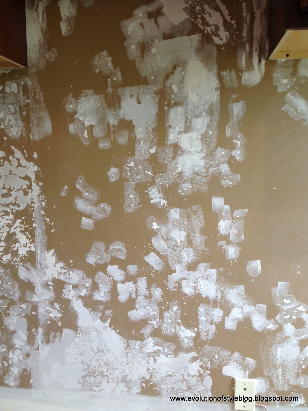
Mind you, I’m still patching walls from the wallpaper removal (I swear, I think drywalling them all over again would be an easier process), but I have two walls that are wallpaper-free, so I slapped the paint up there to see how it looked…

The jury is still out at this point, but it’s growing on me. I just start to freak out when I think it starts to have any smidge of a purple undertone. I swear, grays are harder than any other color I’ve chosen so far! So tricky!
But, it does look better than this hot mess:
On the motivational front – I’m hosting my Bunco group next week, so I anticipate I’ll crack the whip and finish painting the entire room before then! Nothing like a party to light the fire, right?
Do you have a favorite shade of gray? Do share!
Have a beautiful Mother’s Day weekend!


11 Comments
Lisa @ Shine Your Light
May 10, 2013 at 1:20 pmThis is so very convenient for me….I have been mulling over grays for my basement…..and now you are doing all the hard work for me – again!! Why thank you so much Jenny! The color you chose looks fabulous – I think from now on I'm just going to use whatever colors you use, it seems to work for me! Good luck getting it done for Bunco. Hosting is definitely the way to get things done. I am hosting an event for my son's school tonight and I've ticked so many things off the list thanks to it!
Ellie VanCaster
May 10, 2013 at 3:04 pmI swear on the cape may color-looks classy and muteable-dress up or down. I think it will look great with the dark furniture pieces.
Have a great Mothers Day
Steph
May 10, 2013 at 4:53 pmSo close together on my newsfeed… Your post on Gray and then
Thistlewood Farm
Best gray ever! Sherwin Williams Mindful Gray…take a look at where I used it!
http://www.thistlewoodfarms.com/the-new-butlers-pantry#
Great minds think alike???
Jenny
May 11, 2013 at 2:04 amFantastic!! So beautiful! I'm checking out all of these glorious suggestions!
Natalie Gallagher
May 10, 2013 at 4:58 pmJenny,
I had to laugh because I just went through this same agonizing process with a master bedroom that I just redesigned a few months ago. I considered many of the same colors as you, and it came down to SW Mindful Gray vs. BM Silver Fox. Silver Fox won out! Yes, it has violet undertones, but it worked beautifully with the wood tones in the existing furniture. Check it out: http://www.houzz.com/projects/196723/Monochromatic-Master-Bedroom-Redesign
By the way, you are correct when you say that grays are the trickiest color to work with!
Jenny
May 11, 2013 at 2:13 amWhat a beautiful room! The color is gorgeous – and I feel a bit vindicated hearing from others that gray is tricky. I need to embrace it and push forward!
Cassie @ Primitive & Proper
May 10, 2013 at 6:06 pmoooh i think that cape may looks like a winner! i always question paint choices for at least a minute once a room is done. it's a change and i need to digest it. 🙂
Brenda
May 10, 2013 at 10:24 pmI just painted my kitchen and family room Benjamin Moore – Coventry Gray. Absolutely love it! Slight blue undertone but exactly what I wanted!
Calypso In The Country
May 11, 2013 at 1:17 amI completely freak out every time I paint a room. It's always scary to see that new color go up but I have to tell you I LOVE the gray you chose as well as the inspiration photo. I have seen that photo several times and have considered copying every single detail of it in my own home! Grays are hard to work with but I think you will end up happy!
-Shelley
Dawna Motz
May 12, 2013 at 9:12 pmWe have moved to a new property and have done an extensive Reno…still have to post my before n after pictures. I found grey so hard so hard to work with as well. We went with grey owl by Benjamin Moore . I love it …hope you will follow along at http://www.prairiegirl4-thatcountryplace.blogspot.ca. Have a great day.
I got inspiration from the blog "for the love of a house".
1a81a62c-3388-11e3-8ff5-000bcdca4d7a
October 12, 2013 at 9:49 pmPurple undertones, not that I see any in the shade you chose, would not be so bad. It would complement your nice blue plates. Great shade you chose – very classic, not too dark , not too light.