
I love the power of paint, but I will be the first to admit, that having the exterior of your home painted is a daunting (and expensive) project. Plus, it’s not something that can be easily redone if you don’t like it, so getting the color right the first time is crucial. My mom had her house painted once and absolutely hated the color, and I know it bothered her until it was time to have it repainted. I shared some of my exterior house painting inspiration in this post and this post, and when it was all said and done, I ended up going in an entirely different direction than I originally anticipated. And I love it.
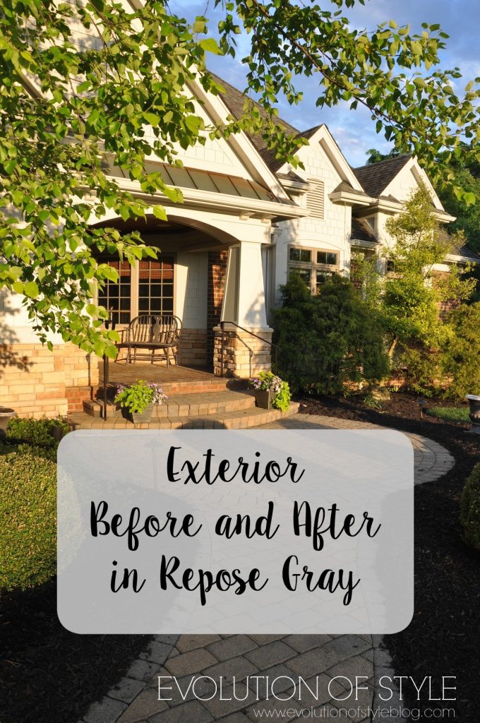
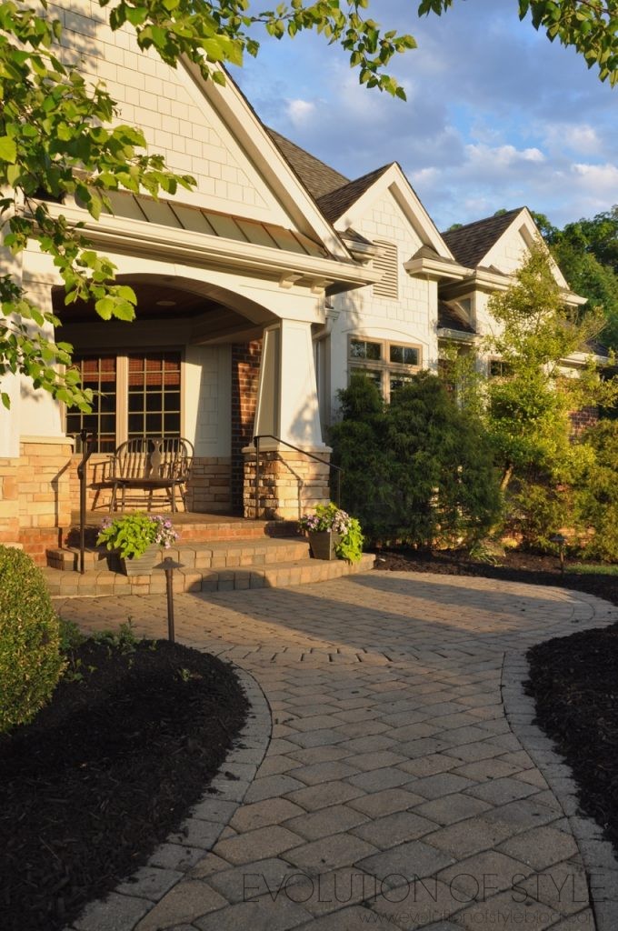
The Color – Repose Gray (25% White)
Yes, you read that right – it’s Sherwin Williams Repose Gray with 25% white. I invested the help of my friend and color expert, Cyndy at The Creativity Exchange, because I needed another set of eyes in making this decision, and I trust her opinion completely. We tried several options, with some being too light or too dark, too warm or too cool. The Repose Gray with the 25% white was the “Goldilocks” color for my exterior – just right.
But let’s take a look back to how it looked before (I think this was before we even moved in – thus the difference in the size of the trees!).
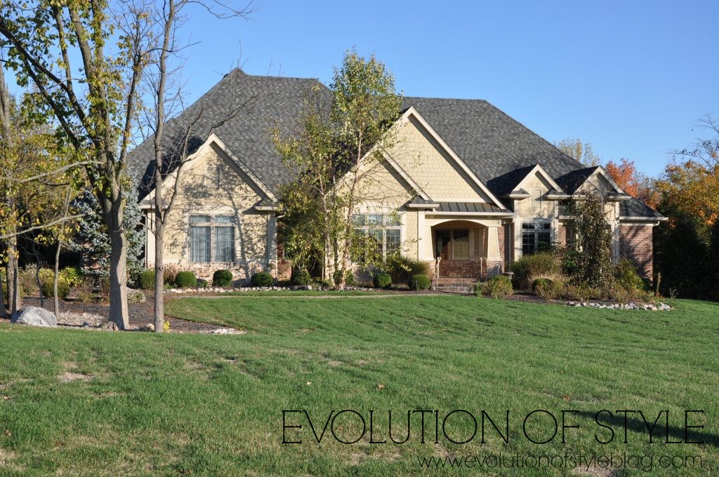
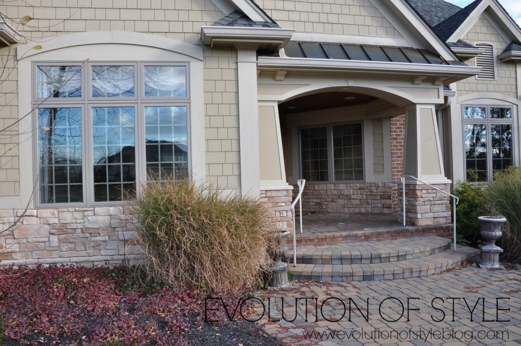
The color wasn’t awful by any means, but some of the architectural details blended in with it. There is some lovely stone work that goes relatively unnoticed because it blends in with the paint color.
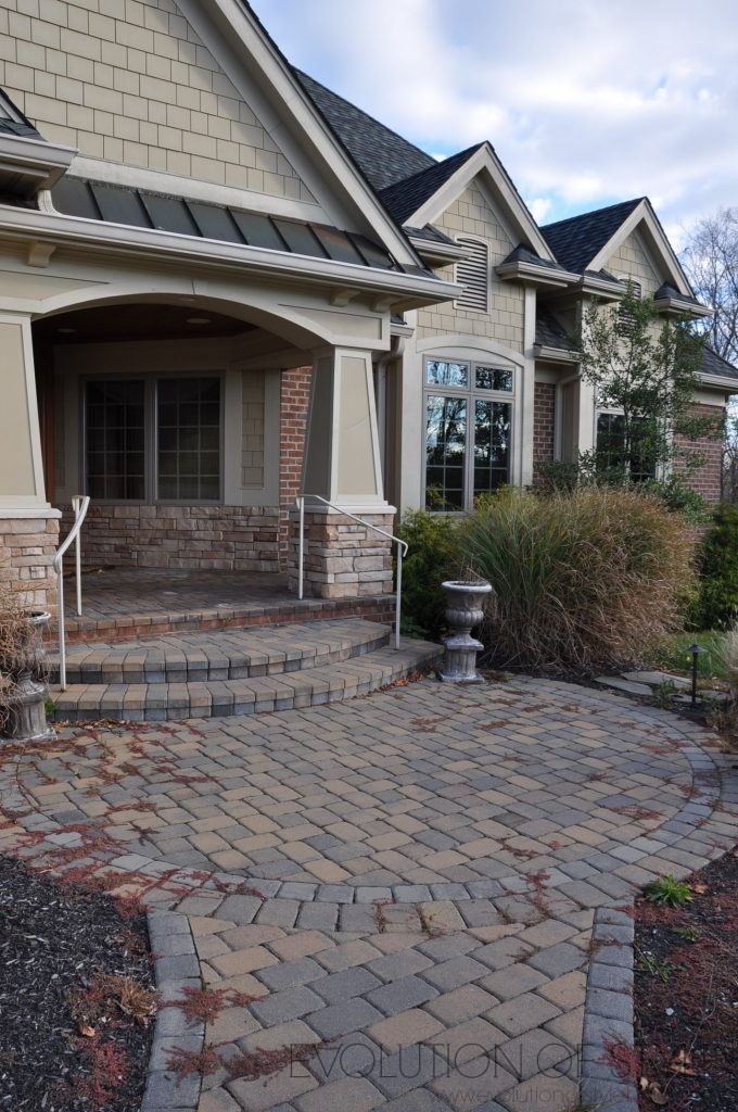
Now, the architectural elements stand out vs. blending in with the facade. Originally, I thought that going dark would be the best way to see the contrast, but Cyndy pointed out that with the large (and dark) roofline, you would notice the color of the house, not the details of the house. She was right.
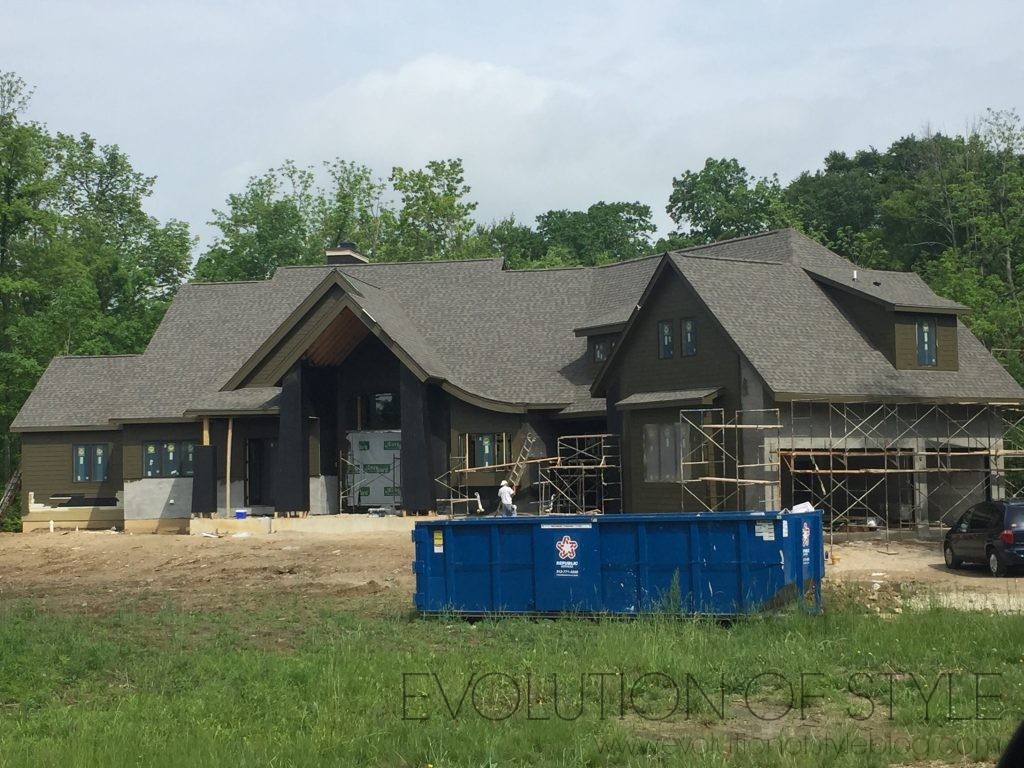
You know that I’m a house stalker at heart, and I love to look at houses as a hobby. This house is one that is in the process of being built, and I’ve been admiring the beautiful architectural elements it boasts. But I have to say that I had a “lightbulb” moment when I drove by recently and noticed the exterior paint color was in the works. This is what Cyndy was talking about when she said that if we painted our house a darker color, people would notice the color and not the details.
I mean, just look at these stunning architectural elements – the roofline, the dormer windows, they get lost with such a dark paint color on the body of the house (even though the house is still gorgeous, and I would love to take a peek inside).
Back to the business at hand…
This is an old photo of our home, (thus the swag drapes in the dining room and overgrown grasses), but it gives you a good look at how the paint looked before.
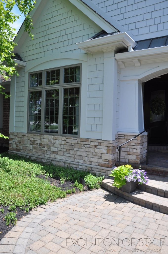
We also decided to go with just one color throughout on the body of the house, so as to keep the focus on the textures and other details that the house offers.
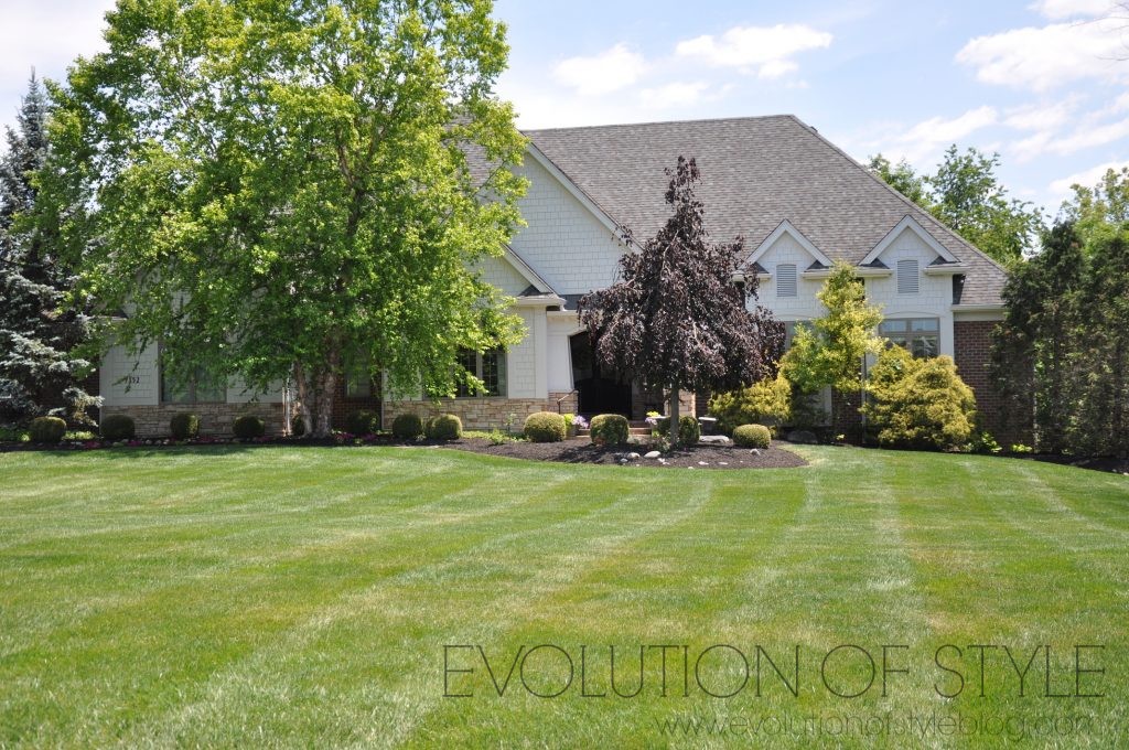
Again, some of these photos are when we first bought the house, but they really show the paint colors well.
I have to say, I love our home at dusk
Let’s also go back to the very beginning and compare the difference from when we bought the house, to now.
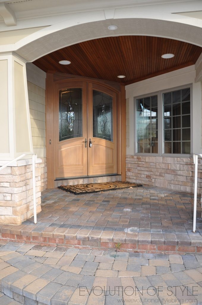
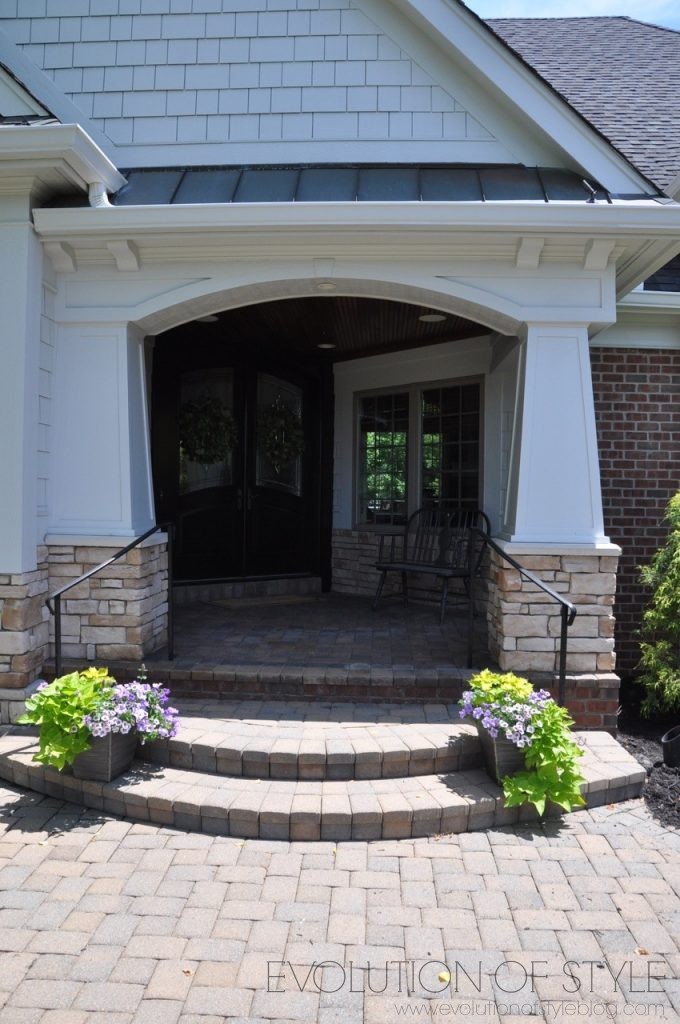
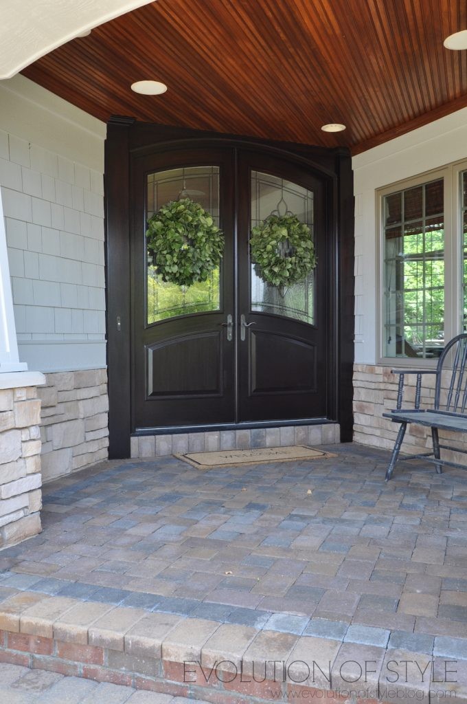
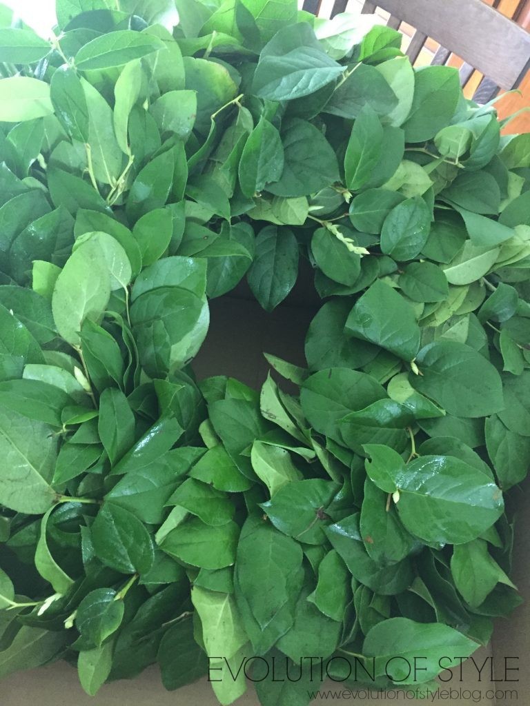
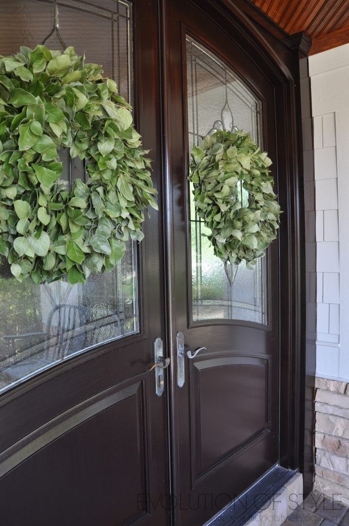
I talked about how I updated the front doors with stain, here, in this Stain Without Pain post. The front doors got a bit of a stain touch up, and are all dressed up for summer with these fresh and beautiful Northwest Salal wreaths from Lynchcreek Farm.
I loved the fresh wreaths I received from Lynch Creek Farm this past Christmas, and their wreaths for the spring and summer months are equally lush and beautiful. You can see how stunning they are right out of the box.
And I love having beautiful wreaths on the front doors. I think it really adds to the charm and welcoming feeling of the front porch. Lynch Creek Farm provided these beautiful wreaths to me to share on my blog, but all opinions are strictly my own.
I have never been disappointed with the wreaths I’ve received from Lynch Creek Farm. They’re always fresh, substantial, and gorgeous. I’m excited to see what they have in store for fall and winter this year (although I’m in no hurry for colder weather just yet).
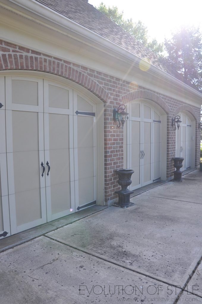
Here is a look at the garage doors before they were painted:
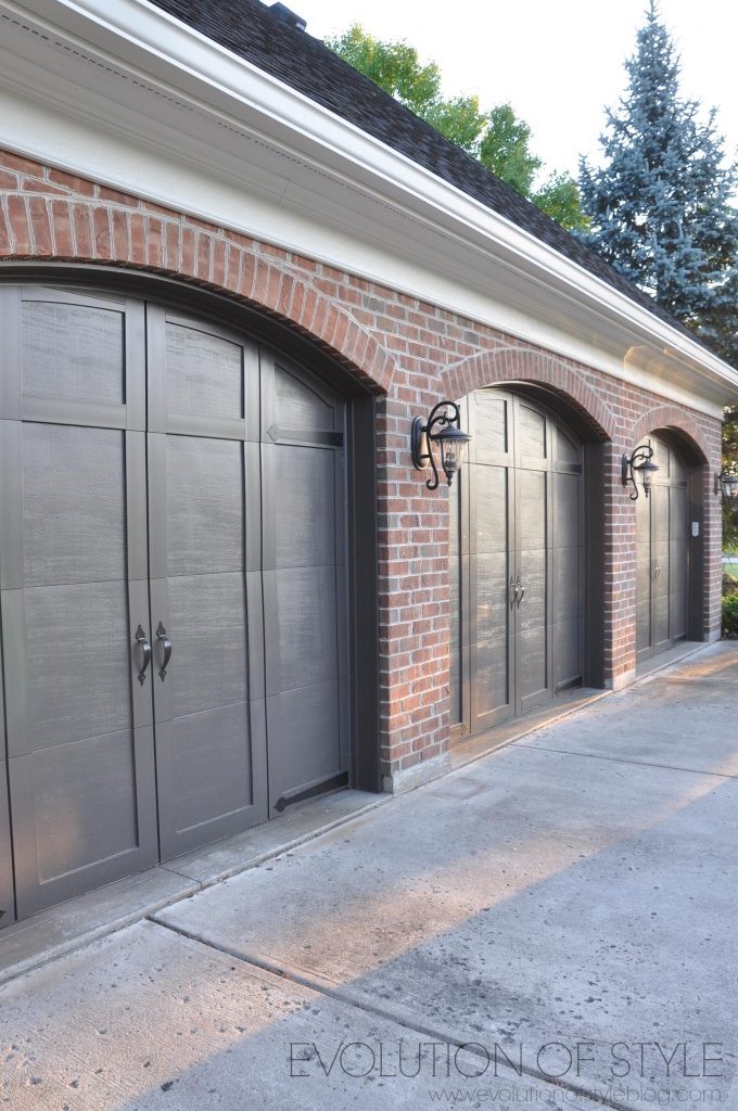
And here they are now. We decided to go dark with the doors, and went with Black Fox from Sherwin Williams.
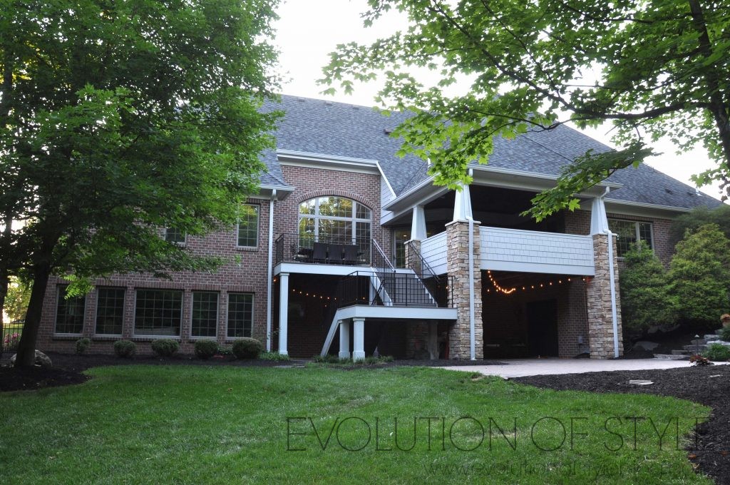
Exterior House Painting – The Back
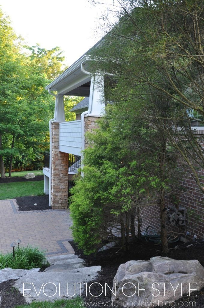
Let’s take a look at rear of the house. It’s not quite as dramatic an update since there isn’t the same amount of painted surfaces. But, it’s fun to compare it from where it began when we bought the house – almost seven years ago. This was before we did anything, including the pond to paver patio transformation.
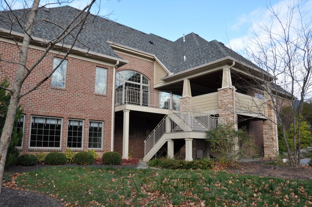
And here it is now (including my outdoor lights that we added for our son’s graduation party).
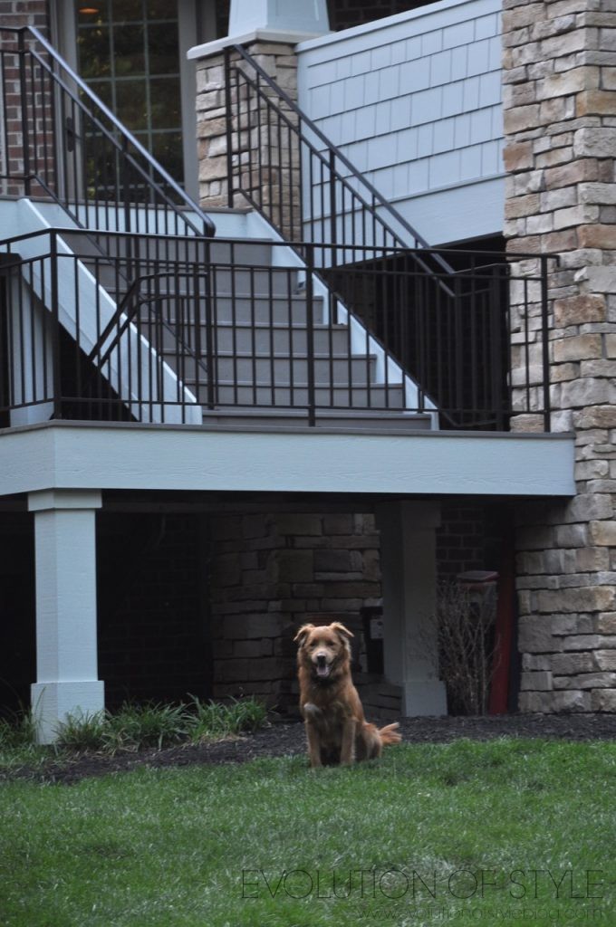
The puppy sat still for a microsecond to post for the camera. Don’t be fooled by his sweet look. He’s a stinker.
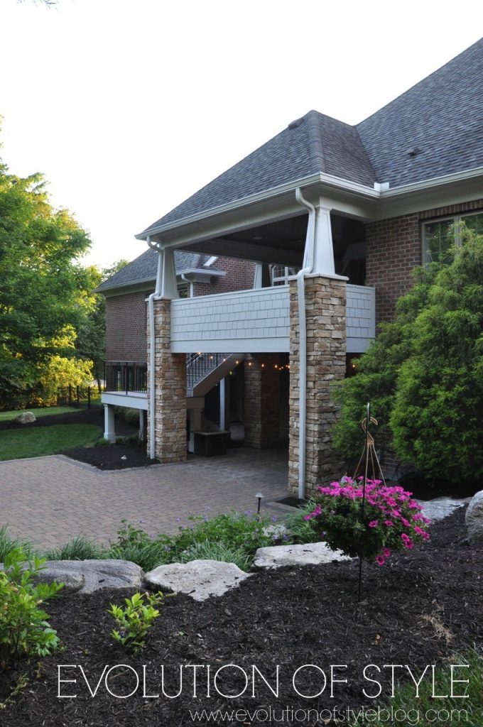
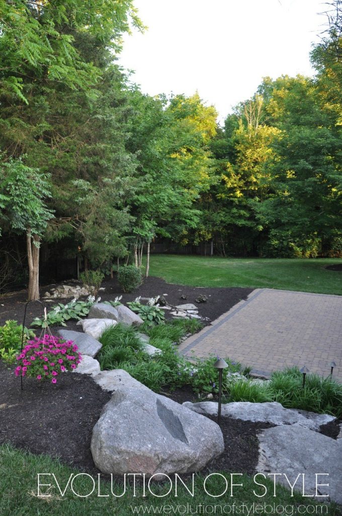
And a shameless plug for how pretty the patio landscaping looks.
Wrapping up, I have to add that a change in the exterior paint color is one that can take some time in which to adjust. And another thing to consider is how different a lighter color can look at different times of the day. It’s really amazing how different it looks from morning to evening. But I’m really happy that we went in the direction that we did, and another huge thank you to Cyndy, for her color expertise! If you have any color quandaries, be sure to visit her at The Creativity Exchange. She has the answers for any color question you can imagine.
Have you painted the exterior of your home recently? Are you happy with it or do you have painter’s remorse?
Jenny

10 Comments
Lauren@SimplyLKJ
June 15, 2017 at 8:56 amJenny it looks fantastic. You really do notice the details more.
Jenny
June 15, 2017 at 5:09 pmThank you Lauren! I’m so glad we went in the direction that we did!
Marty Oravetz
June 15, 2017 at 10:27 amOh wow, the color is gorgeous and your home is stunning.
Jenny
June 15, 2017 at 5:09 pmThank you so much Marty. I feel lucky every day to live here.
jill
June 16, 2017 at 7:07 pmLooks wonderful! You have inspired me b/c we have similar stone accents and I always thought we were stuck with tan to “match” the stone. But the new color def makes the stone stand out more. In the “before” I didn’t even notice you had stone accents! Also love the black garage doors.
One suggestion, have you thought about cutting limbs from the lower parts of the trees to raise the sight lines especially the one on the far left? It hides so much of your pretty house. For your driveway…try Wet N Forget. Its amazing stuff. You will find many other uses for it too. I’m addicted to it…like when you get started with the power washer and can’t stop.
Jenny
June 19, 2017 at 9:29 pmThanks for your kind words – I love the new color! Agree with you completely on the trees – we need some serious tree trimming, and when we got the house painted, it was just more evident! Believe me, it’s on the list!
Michelle @ And Then We Tried
June 26, 2017 at 4:00 pmFellow “goldilocks of paint colors” here. I love the color you chose! My house painting just wrapped up, isn’t it so great coming home to a fresh new color?!
http://andthenwetried.com/2017/06/dark-teal-house-paint-reveal/
WS Painting
July 11, 2017 at 9:01 pmVery nice Jenny! I really like the before and after sequence showing each area of your house. Going darker with your front door really makes it pop against the lighter surroundings – Great decision there. I’m also a fan of the contrast and highlights your new Repose Grey color created against the brick. You definitely have a good eye for the details!
Deb
August 3, 2017 at 12:42 amYour home is beautiful. The lighter color is just right, to make the details pop, including the decision to paint the trim in the same color. I like how the window trim is darker. What color is your window trim?
I’m in the process of re-painting our house right now. We’re going with SW Dhurrie Beige. I almost chose SW Bungalow Beige but it was a bit grayer and cooler, and the brick on our house is warm. I personally liked the Bungalow Beige better, but the Dhurrie Beige is warmer (at least, on our house in our area’s light) and it looks better with the brick. I still need to decide trim color though! We have a dark gray roof. Currently our trim is white and I want a more sophisticated, expensive look. I think darker trim delivers that look. I took pictures of our house and I’m trying darker trim colors in Photoshop! Darker beiges, medium grays. I also really pushed my husband’s patience with all the sample colors before choosing Dhurrie Beige – but all the color choices on large sample boards is the right thing to do, to choose the right color!
Jenny
August 3, 2017 at 11:50 amWe ended up doing the trim and the body of the house all the same color – it’s Repose Gray with 25% white. I did my garage doors in Black Fox.