Happy Monday!
I’ve been thinking about adding a series to the blog this year, focusing on different colors throughout the spectrum, and examining different shades, tones and usages. I figured that I would kick it off with one of the most popular colors out there right now – gray.
When I look out the window right now, that’s what I see – shades of gray. If I were in the paint naming business, the color would definitely be “Gloomy Gray.” I’m looking forward to shades of green, but lucky for us, gray is uber popular right now, inside of the house anyway. Outside, not so much.
I am gravitating towards gray more and more these days, especially after using it in my husband’s office. However, while on the hunt for the perfect gray, I discovered that it’s a much trickier color to nail down than you might think. So, today, I’m going to take you through some beautiful gray hues, going from light grays, to medium, to dark and moody shades.
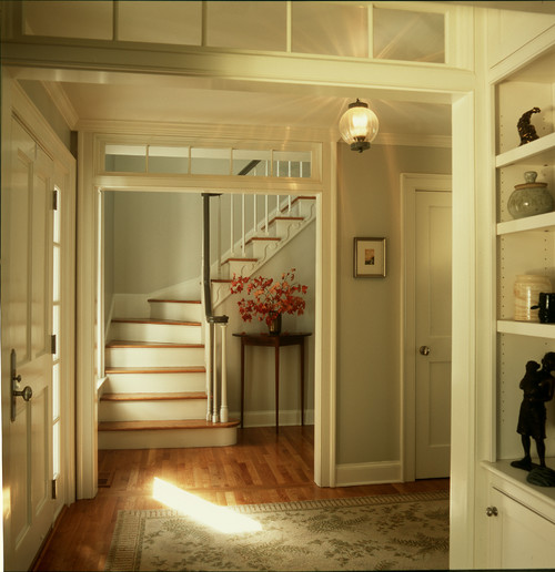
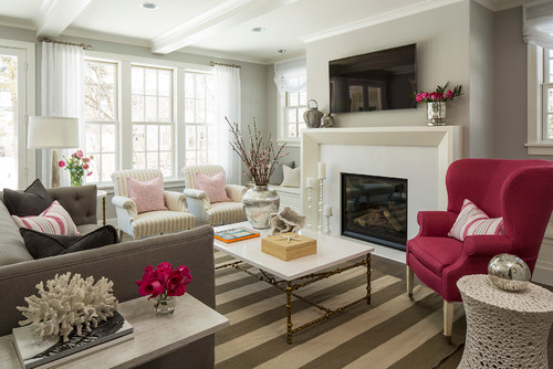
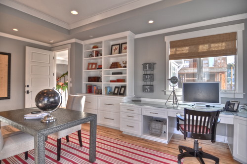
One of the colors that I kept gravitating towards is Gray Owl, by Benjamin Moore. Over and over, I instantly loved it. It’s a really versatile color, a great neutral, that can be used in any room in the house, changing with the light and time of day.
Gray Owl – Benjamin Moore
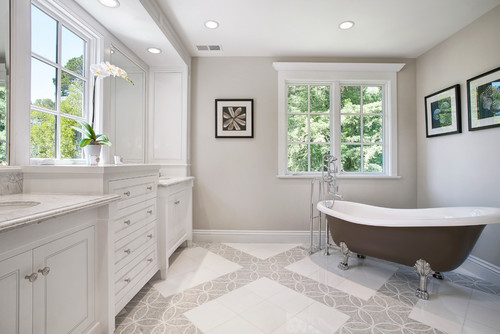
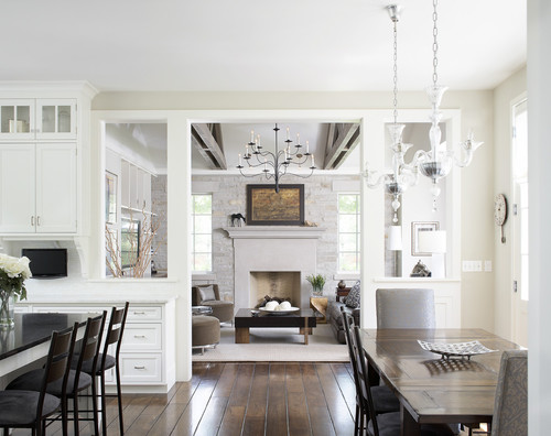
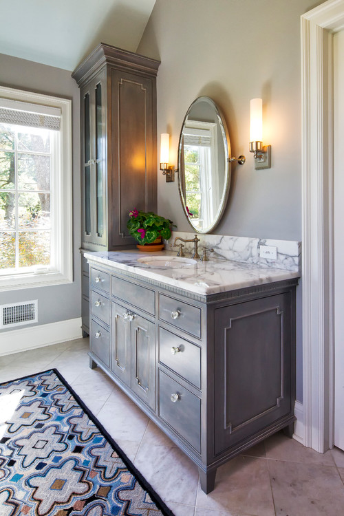
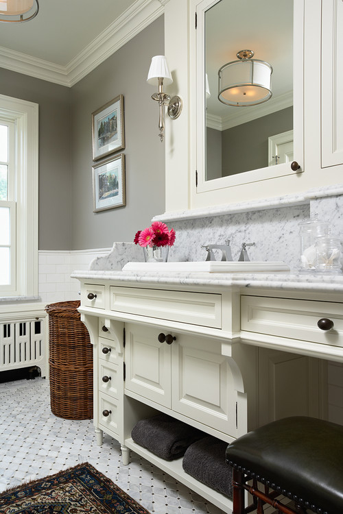
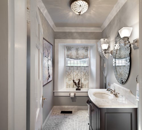
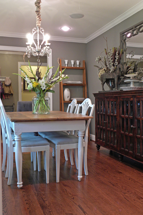
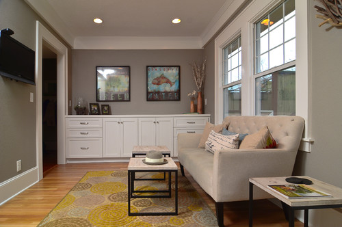
Edgecomb Gray is another beautiful light gray hue that manages to create a warm vibe. Depending upon where you are on the color wheel, grays can sometimes feel cold and sterile. This one hits the mark.
Edgecomb Gray
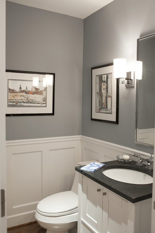
Sophisticated in this stunning master bathroom.
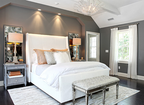
A beautiful backdrop to this pretty pink bedroom.
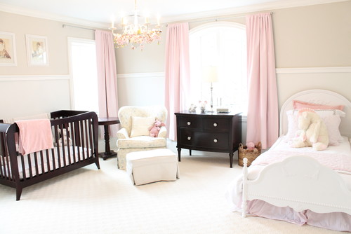
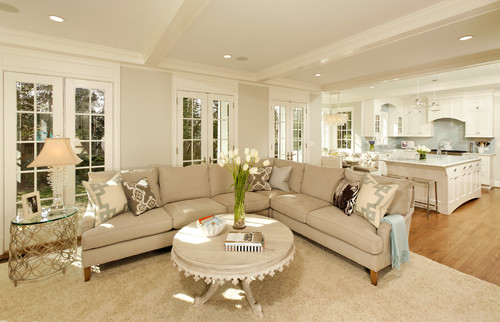
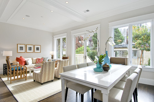
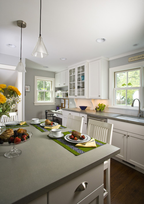
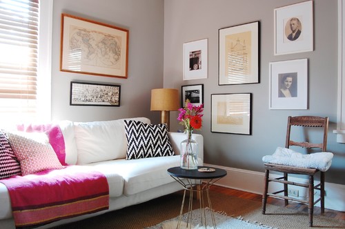
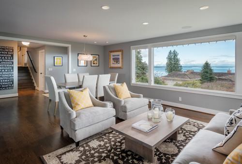
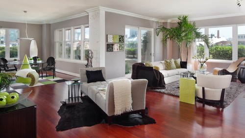
Abalone – Benjamin Moore
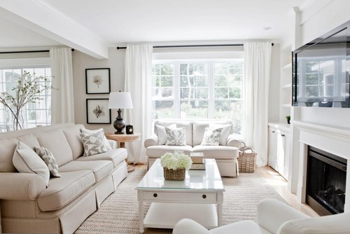
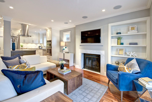
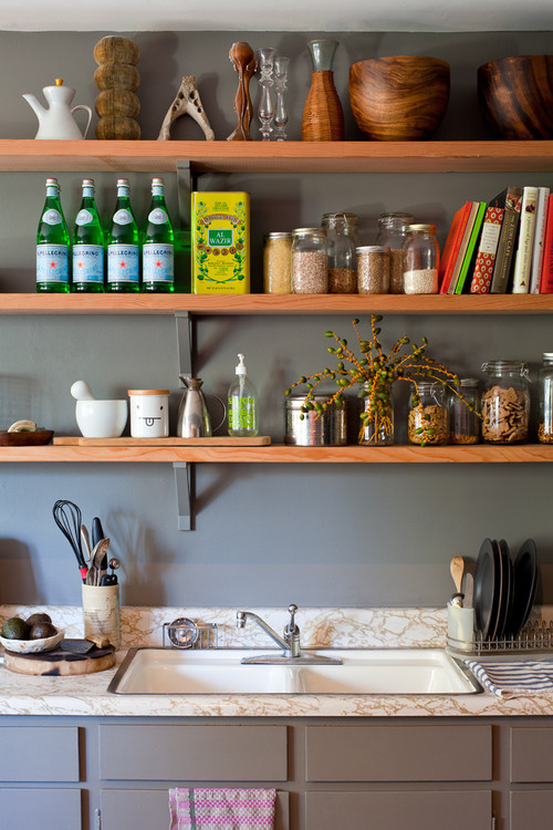
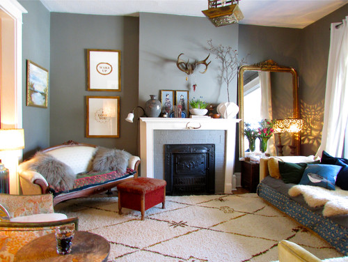
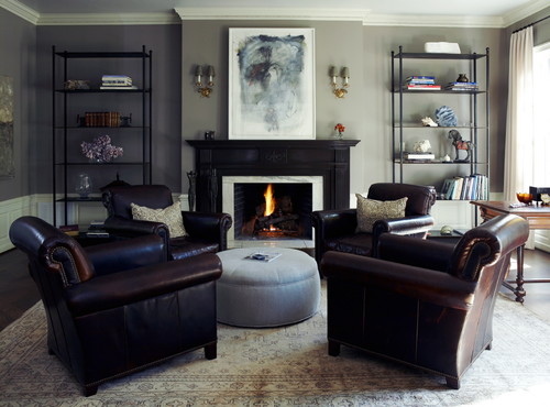
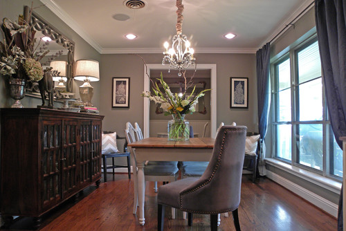
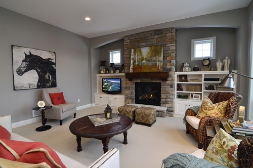
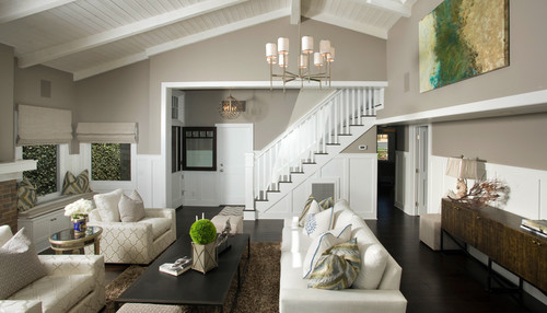
Medium grays can be tricky, depending upon the look you want. My primary struggle was finding a gray that wasn’t too “purple-y”. These are some tried and true medium grays that look great in a variety of different spaces.
Stonington Gray
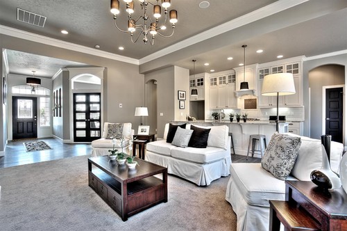
Rockport Gray
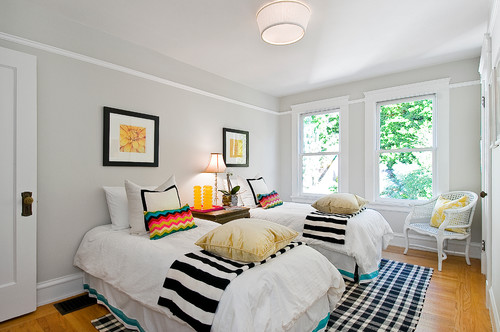
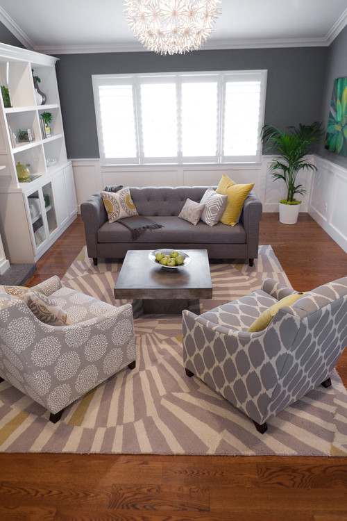
Agreeable Gray – Sherwin Williams
Mindful Gray – Sherwin Williams
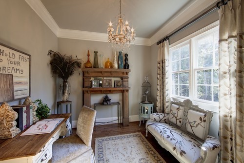
Agreeable Gray – Sherwin Williams
Shale – Benjamin Moore
La Paloma Gray – Benjamin Moore
Agreeable Gray – Benjamin Moore
Pussywillow – Sherwin Williams
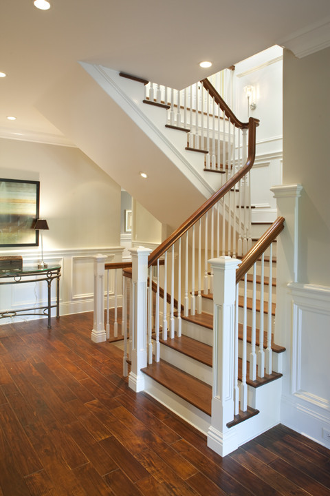
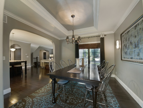
Finally, we have the deep, rich grays that I just love. I’m bound and determined to incorporate a darker gray in my home – somewhere. Whether it’s in a bathroom or perhaps in my kitchen, I think they really add depth and interest to a room, not to mention a touch of drama in some cases.
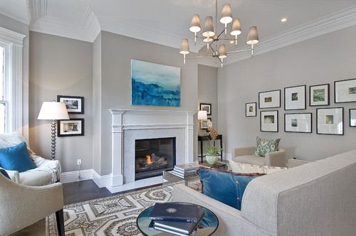
Kendall Charcoal – Benjamin Moore
Even beautiful as an exterior color!
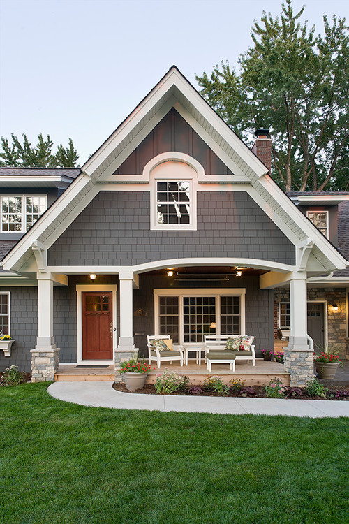
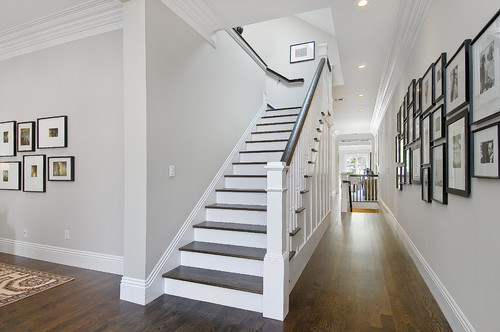
Chelsea Gray – Benjamin Moore

Silhouette – Benjamin Moore
Ashley Gray – Benjamin Moore
River Reflections – Benjamin Moore
Dorian Gray – Sherwin Williams
Englewood Cliffs – Benjamin Moore
Coventry Gray – Benjamin Moore
Amherst Gray – Benjamin Moore
Pikes Peak Gray – Benjamin Moore
Functional Gray – Sherwin Williams
Requisite Gray – Sherwin Williams


11 Comments
Lisa @ Shine Your Light
February 10, 2014 at 3:19 pmI am thrilled that you are going to start this as a series, Jenny. I can't get enough of paint color inspirations. Love seeing all these different grays in beautiful spaces. It's so daunting for people to envision a color in their space and this will be a great resource for me with my painting jobs. I have Edgecomb Gray in my dining room and basement and can attest to the fact that it is a warm neutral…..very light and easy on the eyes.
Jenny
February 10, 2014 at 5:10 pmI'm really loving what I'm seeing with these light grays. It's nice to find a light gray that is truly warm, since that seems to be my biggest worry when looking at light grays for my home.
Gwen
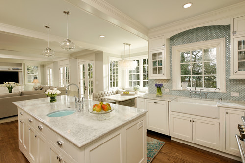
February 10, 2014 at 4:23 pmthanks! Just a note though; the first photo under 'Abalone' is actually BM Balboa Mist, per the designer at Houzz.com. They list several photos of that room/adjoining kitchen, all under BM Balboa Mist.
I'm deciding between Balboa Mist or Edgecomb Gray for our downstairs dining room/living room open space. Love a warm light gray; the cool light grays are too cold/sterile to me. I will be accenting with turquoise (beach decor area)…very excited, and thanks for bringing more options to me!
Jenny
February 10, 2014 at 5:08 pmThanks Gwen – I'll make note of it. Balboa Mist is another great color out there in the light gray family!
Kelly
February 10, 2014 at 9:12 pmOne I keep going back to is B.M. Revere Pewter. I just bought bedding for the master bedroom and am trying to find the right grey
Simply LKJ
February 10, 2014 at 9:39 pmGreat inspiration photos! We are looking at gray here too. Under another Winter Storm Warning. So ready for spring.
Kris @ Driven by Décor
February 12, 2014 at 1:11 amWhat a great post – I'm a paint color junkie! We painted our old home office Martha Stewart's Zinc and I loved it! Also love, love SW's Keystone Gray – a brownish gray that I used in our old house and again in this one!
Mary Elizabeth
February 20, 2014 at 1:13 amI have used Edgecomb Gray extensively in our home and it works everywhere. But even though I love the rooms that are shown with Revere Pewter, is seems to "read cold" whenever I try it. I wonder if it is due to the number and direction of windows in most of my rooms. I used Stonington Grey for the dining room that has west and north windows, and that really pulls out the blue. Now I'm trying to find a blue for my kitchen that will work with Volga Blue granite & make the iridescent blue in the stone "pop". If anyone has a good idea for that, I would love to hear it!
Yatika Dhingra
October 7, 2015 at 5:40 amThanx for sharing….
Stone supplier
Deb
March 8, 2018 at 10:54 pmMy walls are currently cork wedge by sherwin Williams. A new hardwood floor is making them read too gold. I’d like to go more gray. Which gray would would go with drapes that are a cork wedge color, white woodwork, medium brown floors & lots of natural light from east, west & north.
Amalia Almasy
April 18, 2018 at 9:27 pmI love this (timeless) post! thank you! I’ll continue to refer back to it for color and decorate inspiration!